
Every page on your site should have a clear Call To Action. What is a Call To Action? It’s the next step you want your user to make. The clearest example is the product page on your Zen Cart. The Call To Action is the Add To Cart. You want visitors to purchase from you and the next step at this point is adding the product to their cart.
There’s a simple rule of thumb when designing web pages (and websites). It’s also the title of a great book now in it’s 3rd edition, Don’t Make Me Think. The idea is simple, don’t make them think. Don’t make your site visitor try to figure out what they are supposed to do next. They won’t read instructions or long text. Many studies have shown that people will skim a page, rather than read it.
Make it painfully simple. Tell them what to do and make that part of the page, be it text or an image, stand out. When they skim the page, the Call To Action needs to be obvious.
How do you make it obvious?
- Use a button of a contrasting color.
- Make the button BIG.
- Make the text bold.
- Make the text bigger.
- Use more than one technique!
It’s a little counter-intuitive, but think gaudy. Not to the point of obnoxious, but close. The Call To Action needs to be painfully simple to find and obvious to all of your visitors.
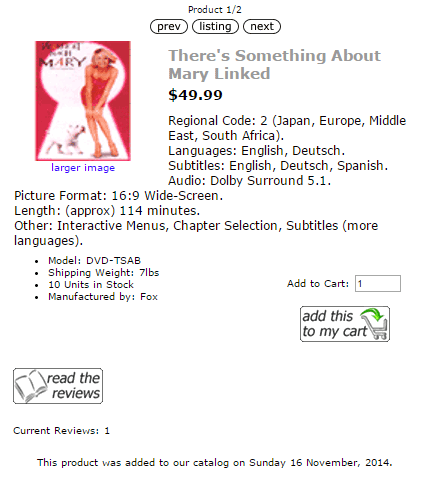
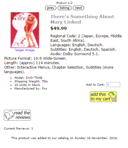
Look at the two images below. The one on the left is a stock Zen Cart with the Classic Template. The one of the right is the same product on the same cart but with a different Add to Cart button. Notice how your eyes are drawn to the yellow button?
Leave A Comment